
Top 4 Print Features to Include in Your eBook
In continuing our series on print-to-digital design production, we take a look at what print aspects are important to preserve in the new, digital version. This post is all about maintaining familiarity, while still offering a fresh experience for digital readers.
Transforming static text into interactive, digital content requires a bit of imagination. At Inkling, we’ve often gotten creative when working with our partners to redesign print books and products for the scrolling screen. A big part of that process was figuring out which new features we could employ or how we could restructure the content to fit a digital layout. Oftentimes, this meant radically re-thinking how certain design elements worked for the digital version, so much so that these elements were unrecognizable in print.
But as much as we wanted to give readers an altogether different experience on a screen, we also knew that there was value in keeping some of the original features from the print design, too. The print versions had been successful for a reason, and we wanted to celebrate their unique look-and-feel and branded elements as much as possible. We also needed to make sure that readers could navigate the digital version as easily as they could a print book, using familiar signposts. With this in mind, over time we identified several key design elements that we generally replicated from print to digital. Below are our top four print features that you need in your digital version:
1. The Cover
It’s easy to overlook the importance of a digital book cover because, frankly, there aren’t any pages to cover. But just as a print book must stand out in a crowded bookshelf, we knew that the digital version had to attract readers browsing a virtual library. We always represented the book with the same cover not only because we didn’t need to fix what wasn’t broken, but also so that readers can quickly find what they were shopping for, whether they were looking for a print or digital version.

2. Page Numbers
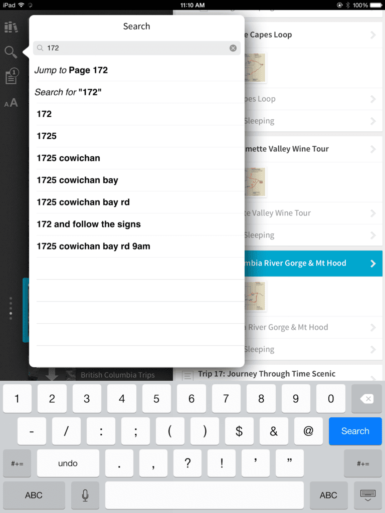
Unlike print books, page numbers aren’t intuitive to the scrolling screen, nor are they necessary with a digital search function. Yet we knew that, as classrooms transitioned into the digital era, half the class would still have the print book. To keep everyone on the same page (pun intended), we retained source page information in the markup so that page numbers stayed tied to the content and appeared subtly in the left margin of the reader. If an instructor said, “Turn to page 55,” for instance, an Inkling user could quickly search for “55” and jump to the content that corresponded to that print page.
3. Icons
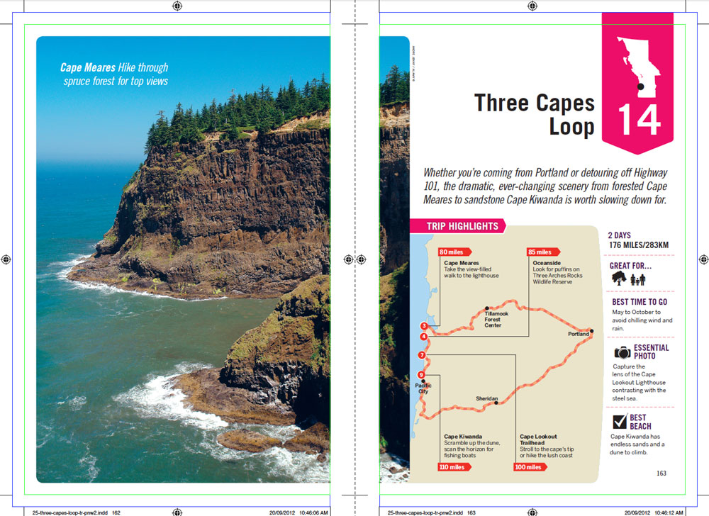
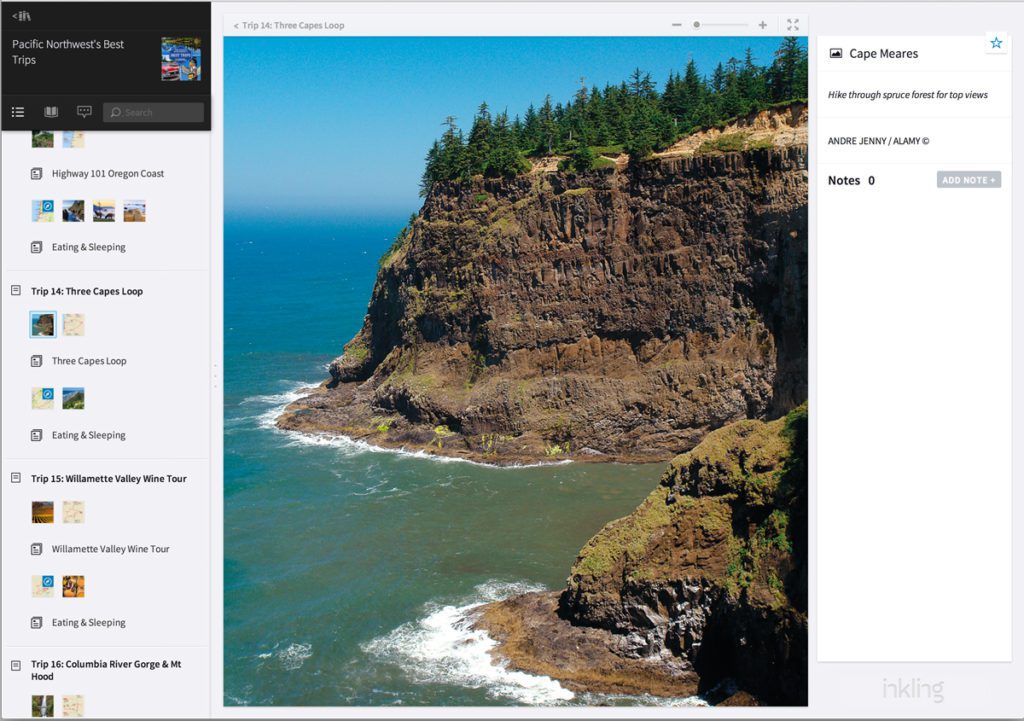
When we expanded our library from textbooks to trade learning content, such as Lonely Planet’s travel guides, we were tasked with translating an existing visual roadmap. In the case of Lonely Planet, color-coded icons help readers navigate through descriptions for landmarks, hotels or restaurants, and it was imperative for the sake of continuity and years of training readers to use the icons that we retain that same system. This was as much about providing readers an easy transition from print to digital as it was about preserving Lonely Planet’s brand. These symbols had become a Lonely Planet trademark, and we wanted to celebrate their existing design.
![]()
While we kept that same design, we were also expanded upon it in a new, uniquely digital way. Lonely Planet’s phone icon, which indicated a number for any given destination, now expands into a hyperlink that readers can push to call when reading the content on their mobile devices. This offered a better user experience within the original print bounds.
![]()
4. Original Assets
The image quality of print is hard to beat, and we knew that at the very least, Inkling content had to capture the high fidelity of the printed image. In order to begin production, we needed to gather the original image assets from the publisher. We asked for files in their highest quality form, like EPS, and converted them to optimal sizes for desktop and retina screens. It was a simple measure, but one that proved our commitment to design quality for whatever format the content was consumed in.
The Bottom Line:
When reinventing a print product for digital formats, it’s important to be mindful of the big leap that we’re asking readers to take as they transition from turning a page to turning on their device. While we always aim to delight our readers with innovative, engaging experiences, the new features that we implement are only successful because they’re rooted in a familiar structure. When we gave readers a familiar starting point, we were able to let our imaginations run wild thereafter.
To learn more about creating successful digital content, download our webinar on the five must-ask questions for digital content creation.
Sources:
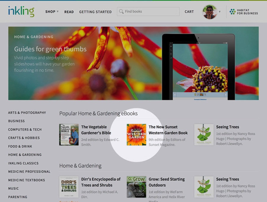
Brenzel, Kathleen Norris. The New Sunset Western Garden Book: The Ultimate Gardening Guide. New York, NY: Time Home Entertainment, 2012.
Krause, Mariella. Pacific Northwest Best Trips. Footscray, Vic.: Lonely Planet, 2013.
About the Author