
Web Development Essentials for Content Designers: Page Reflow
This series offers print designers transitioning from InDesign to HTML an introduction to web development. After discussing composition, my second post focuses on page reflow.
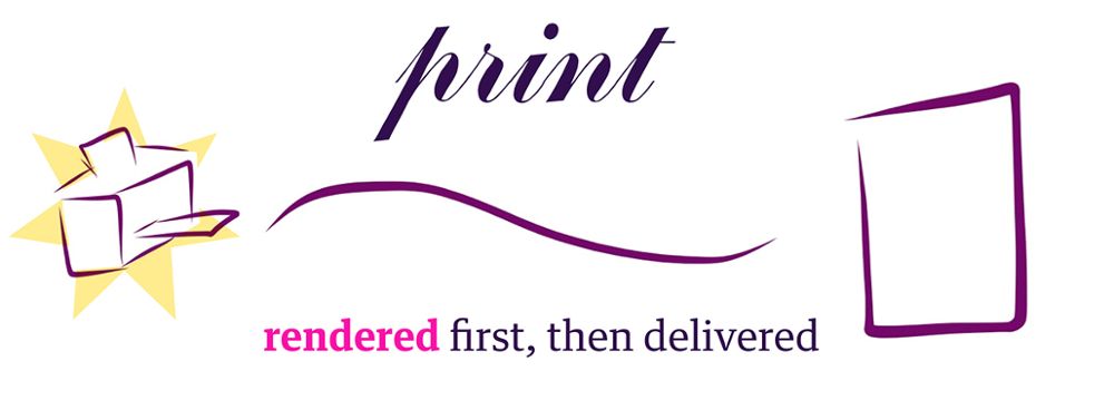
One of the most important differences between print and digital content design is how the design reaches the end user. Print design is first rendered (printed) and then sent to the reader exactly as it was printed.
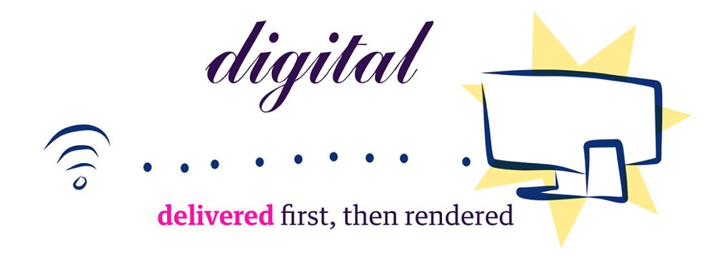
Digital design is first sent to the reader, and then rendered by their particular devices.
Years ago, when digital content first began to take shape, this difference hardly affected content design. There was a limited number of screen sizes and most of them emulated traditional print media, anyway. However, as more and more mobile devices came online, it became clear that simply shrinking down the contents of a page to fit a screen was not a suitable solution.
Enter responsive design. With responsive design, designers could create one flexible design that adapted to any given device. Fundamental to responsive design is page reflow, or the idea that digital content can (and should) change its layout to fit the constraints of the device on which it is being rendered.
Even though responsive design does much of the heavy lifting for designers, there are still important concepts to consider. In this post, I’ve outlined four key tenets of page reflow to keep in mind when designing responsively.
Page Dimensions
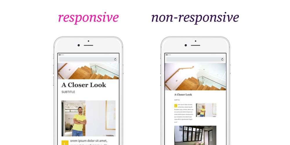
One of the biggest differences between digital devices is the width of the screen and, consequently, the width of the content. While the width is usually a fixed dimension, digital designers can increase the page length, allowing users to scroll a page to view additional content. In the example below, the page reflows for smaller screens by increasing the overall length of the page.
Notice how the font size of the content did not simply shrink in proportion to the page size. Instead, the content reflows by wrapping the text at different line lengths. When designing mobile layouts, take into consideration that text size is not permanently tied to screen size, and developers can implement these kinds of variations through CSS.
Responsive Layout Guides
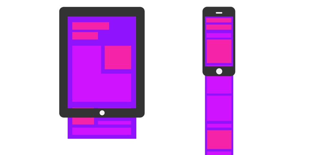
Since page width is typically the biggest layout constraint, designers will often use a vertical grid of columns to organize content. The columns extend indefinitely since the length of the page may change as the content reflows to fit smaller screens. The width or amount of columns is entirely dependent on the design and can even change as the page reflows (smaller screens may have fewer columns).
Content Order Still Matters
Reflow allows designers to change the perceived visual layout of content, but it’s important to remember that the HTML, the underlying outline of the content, still has a strict order. This means there’s a limit to the amount of layout changes that can be accomplished with only CSS. While a design can easily accommodate an image changing size, it would be much more difficult to change the order of the image and the paragraph.
Mobile screens tend to draw attention to the content order because many of the elements span 100% of the page width, since they cannot accommodate as many columns as a larger screen.

Accepting Minor Differences
One of the downsides of letting the users’ device render content is the lack of precise consistency. It is inevitable that inconsistencies will occur on different devices, mainly caused by different rendering software. Margins and font sizes might change slightly or layouts may appear relatively larger on one device than another.
Instead of fighting these anomalies, adapt your design to accommodate for these differences. Allow design measurements to remain fluid whenever possible. When considering sizes for images and other media, try thinking in terms of percentages instead of fixed width. It’s much easier to make an image span 50% of it’s available area than always trying to define a pixel value equal to half of the screen width.
The bottom line:
With all of the different-sized devices used to read your content, creating the right design may feel like an overwhelming challenge. However, by shifting your thinking from designing for a fixed page to page reflow, you’ll structure your design by new restraints and, more importantly, new opportunities. In my next post, I’ll talk more about these new opportunities by explaining how to convey interactivity through design.
For more information on how content designers can use Inkling Habitat to create beautiful digital content without a web developer on-hand, request a demo from our sales team.
About the Author